Sometimes the difference between "Wow!" and "WOW-OH-WOW-OH-WOW!" is a pretty small detail. Like about three inches. Sometimes, size matters. When I spec'd crown moulding for these cabinets, I designed a three piece stacked crown, but somewhere between me and the client's carpenter, the vision was lost, and though all the wood was there and pre-painted, only one of the three parts went up. It looked pretty good, and the homeowner left it for several months, then called recently to see if my carpenter could change it to the original plan.
The reason for the stacked design was to add a touch of drama to a boring builder-oak kitchen. The paint would go a long way toward that, but Sarah likes things bold. One thing she doesn't like is a lot of high-maintenance, dust-collecting clutter on top of the cabinets (unlike me, she actually dusts things on top of the cabinets), and in their original state, with no crown at all, the big space on top of them had to be filled with something. Her request was for really cool crown moulding that would be interesting on it's own, and tall enough to negate any need to put pretties on top of the cabinets.
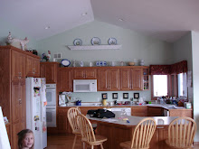
Basic crown worked...
 |
| Ember-rubbed cabinets with basic crown moulding |
...but stacked crown worked better!
Ember-rubbed cabinets with stacked crown moulding.
 |
| Close-up of crown detail. Click to enlarge. |
Do details like these cost extra? Of course, but Sarah and Randy chose these details over some of the more usual upgrades. They chose to stay in a modest suburban home, instead of purchasing a larger, newer one, and then, since the kitchen really couldn't accommodate any significant change to its layout, they kept the original, perfectly functional, oak kitchen cabinets, and had me paint them. Although they considered upgrading to stone or something like Cambria, the Formica counters were instead covered with an epoxy-type finish that mimics granite (except the one I custom painted - scroll back through this blog a month or so to see it), and rather than replacing it, the dining set was given a funky finish, since they liked the style, just not the light oak color. They got a completely new look to their space, including two bathroom remodels, and a couple of vacations, for less than most people spend on a kitchen remodel. That's a detail worth noting!
If you would like to hire me to help add details to your home, click on over to my website for more information theartofthehome.com.
If you are working on your own details, but are stumped as to the technique or materials to use, please feel free to email me. If I know the answer to your decorating or craft dilemma, I'll be happy to share. dawnmariedelara@gmail.com.













No comments:
Post a Comment