Ornamental Plaster Sculpting, Mural Painting, Faux Finishing, and Imaginative Interior Design.

Ornamental Plaster Sculpting, Mural Painting, Faux Finishing, and Imaginative Interior Design.
CLICK ON THE RABBIT ( yes, those are cabinets) TO SEE MY PORTFOLIO, AND LEARN MORE ABOUT MY SERVICES...theartofthehome.com

Wednesday, February 29, 2012

My Contact Info

You found me!  You might have seen the article about me in the Leap Day edition of the Minneapolis Star Tribune.  You might have called information for my phone number.  You might have found that they have no listing for me.  Let me first say, "Aaaaaaaaarrrrrrrrrgh!"  Deep breath.  Okay, I'm all better, and in a couple of hours when they open their phone lines for business, I'll try once again to straighten out this problem.  Next, let me appologize for the inconvenience, "Sorry 'bout that, I wish I had double checked that before this morning, but glad you found me here!", and finally, "Happy Leap Day!"  (Though if you're around the twin Cities this morning, stepping gingerly on the ice rink that arrived overnight might be wiser than leaping.)

You can reach me by telephone at (952) 228-1914.  You will likely have to leave me a voice mail, as I don't get to spend an awful lot of time here at Belle Amie, as I'm super busy out making other people's walls pretty.  This week, I'm hanging out at Minnetonka Country Club, so if you're a member, better check out the new look to the Fireside Room there in a week or two.  Non-members can check back on this blog to see a marble technique done with troweled on mud (Yup, I'm playing in the mud again.  Scroll down a few posts to one titled "Playing in the Mud" to see some cool tiles).  Might post the country club photos Thursday night, or may wait 'til Monday night's post.  Something new here twice a week, so come back often!

The easiest way to set up an appointment with me might be via email.  That's dawnmariedelara@gmail.com

You can view my portfolio and read the information on how to hire me at theartofthehome.com.  Clicking this takes you the same place as clicking on the rabbit cabinet picture at the top of this page.

Here are a few pictures of Belle's that might not be on the website yet:

Kitchen chalkboard, on which I should have written "Check back with the phone company."

Here's the full view of the hummingbird plaster featured in the Strib.

Oops!  I forgot to show them the back porch!

Monday, February 27, 2012

Pictures Perfect

I love to save pages from magazines, and have a whole huge file drawer, wait, make that two drawers, full of them, not to mention scrapbooks of favorites.  Yes, I know about Pinterest, and I have started using it, but it's a different experience from curling up on the sofa with a stack of magazines and a pair of scissors, when I'm in need of a break from useful pursuits.  A huge mug of sweet, milky, strong coffee is the perfect accompaniment, along with whatever music suits my mood at the moment. 

Living Well photo wall.
Flipping through clippings last week, I noticed I had saved several versions of the "wall of photos" idea , and decided to start one of my own.  I had a few pictures I wanted to hang in my office, and since this is one of the few rooms with solid color paint, it's perfect for this.  Not that you need solid paint to make the photos look good, but that if you build it as you go, which I am doing, you will eventually decide to move some of the pictures around, and will need to be able to patch and paint nail holes every now and again.  Way easier to do on solid painted walls.

The centerpiece of my first photo wall is a shot of my parents, featured on the cover of "Living Well", a section of their local paper.  This set the theme for the whole display, and helped to narrow the selection process.  Not noticeably narrowed to anyone else perhaps, as it may be hard to tell the connection between two dogs tussling over a stick, my Aunt Rose's barn painted with giant sunflowers, a childhood friend caught in the bliss of eating Mystic Mint cookies, and a polymer clay fish sculpture.  It doesn't really need to make sense to anyone else, though.  It's my personal wall of fame/ bliss list/ hall of champions, all reminding me why I do what I do, in an office I don't share with the public.  (I do meet with clients here at the house, but I use the work tables in the studio, or the adjacent "dining" room, to spread out portfolio and samples.)

This newspaper feature photo of my parents makes the perfect anchor for the rest of the montage.
Some people tie this look together by using only black and white photos, or all one style of frame.  I chose to be less matching, and decided to unify them all with black frames, many with little bits of moss green, gold and red, colors found in the rest of the room, to accent.  I also mixed in a few prints and postcards, as well as a display bracket for the fish.  It isn't as uniform as most of the magazine pictures I've seen, but it pleases my eye.

A changeable photo display board in the foyer is a great way to share current snapshots and cards with visitors.
Now, unless I cover the walls of several rooms (yikes!), not every photo gets to have a frame, but I wanted to have someplace to display those that come in Christmas cards, and the snaps from weekend outings with my friends.  You know, the kind of photos you want to enjoy for awhile, before tucking them into albums or memory boxes.  For this, I created a chicken wire photo frame, to hang in my foyer.

One old picture frame,  leftover chicken wire from another project,  recycled grosgrain ribbon from a trade show display, salvaged and clearance trims, all hung from a length of old ball chain and a drywall screw onto which has been hotglued a perfume bottle top.
If you make one of these yourself, here's a few things you may want to know
  • Before assembling, I painted the chicken wire black with spray paint, as I didn't want bright silver.
  • On this one, the wire is stapled to the front of the frame, to help keep it spaced far enough from the wall to get the clips on, and to avoid marking the wall with scuffs and scratches from the wire.
  • If you staple your wire to the back of the frame, glue halved wine corks to the corners, as spacers.
  • Grosgrain ribbon and scrapbooking paper flowers cover all kinds of staples, nails, and scuffs.
  • Plan a hanging apparatus that looks good, because it's pretty hard to hide it.
  • Clip on the cards and photos with binder clips from the office supply store.
  • My favorite heavy duty stapler for these kinds of projects is the cheapest one made by Arrow.  It's the easiest one to aim, gets into tighter corners than the pricier ones, and I haven't found any of the fancy features of the others made them any easier to get the staples in deep, unless you upgrade to an air powered one.

Detail:  grosgrain ribbon covers staples, and scrapbook paper flowers, with old jeans snaps for centers, embellish the corners.  The metal tassle is very old, and was found hanging from a nail in the attic, here at Belle Ami.  Binder clips hold the photos, and yes, this adorably picture perfect couple (Joe and Pamela) is known to me, and not the display photo from a department store frame.
On the subject of photos, this week I get to follow in my parents footsteps, as the cover story for a section of the local paper.  Those who get the Minneapolis Star Tribune might want to check the cover of the Variety section this Wednesday, the 29th of February, where you may see some of Belle Ami in a whole new light...or at least clearer photos.  Photographer Courtney Perry apparently took so many great shots of my dear old house that she got us bumped from a small story inside a Sunday section, to this feature spot, with additional photos inside.  If I may speak for the house, we're pretty excited!

You can view my reasonably decent photos of some of my work at theartofthehome.com, where you will also find all the information on how to hire me.

If you need clarification of the directions for this, or any other crafty project, feel free to ask in the comments below, or email me at dawnmariedelara@gmail.com.  Don't hesitate to ask,  I truly don't mind, and in fact, I love to hear about your creative projects.

Friday, February 24, 2012

Doodle-dee-do

You might know that before I worked as a decorator, I owned a little sign company, Cheshire Signs, in Fairbanks, Alaska.  I mostly did signs for small local businesses, and specialized in illustrated and antique reproduction styles.  Usually, these jobs involved doing pen and ink logo designs, as well.  I still like to do pen and ink illustrations, so sometimes I do these little mock logos for friends and clients.  Never as fussily perfected as my commercial designs were, just loosely drawn, for the fun of it.

This mock logo is for the clients who had me paint the pantry mural below, which was featured on this blog a few weeks ago.  Not sure how they might like to use it, but I use mine to label baked goods I give as gifts.

 Actually, now that I think about it, I've been doing these mock logos since before my sign shop days.  The first I can think of is one for cookie gifts I sent to my dad, when I was first out on my own.  It was for "Bear-Bear and Josephine", and featured a drawing of my beloved teddy bear (which papa once backtracked 45 miles for, when I forgot to bring him on the family vacation), taking a sheet of cookies from the oven of Josephine, our family's beloved antique wood-burning cook stove.  Had I remembered it earlier this evening, I would have dug around for that, as I'm sure there is a copy here, somewhere.
My favorite chubby rabbit adorns the card that accompanies all baked goods that leave my kitchen.
My own personal logo features Bucko (pronounced Boots' ko), the rabbit from my kitchen cabinets.  I like using it on the card that accompanies cookies or bread that I give as gifts to friends.  These little pretend logos are a fun way of having one's fantasy business, without actually doing all the hard work.  I may love to be up at 4 a.m., but I would hate having to start my work day that early.  Despite the suggestions, I will never be a baker, a caterer, a B & B owner, nor probably a PT Barnum, with a circus of acrobatic folk dancing frogs.  Ah, well.  I'm liking the artist thing just fine.

Lately, I've been doing a lot of pen and ink drawing, tinted with watercolor.  The sample below is a sneak peek at some elements for one of the collages I'm working on.  They're for a book I'm illustrating and co-authoring with Cat Isles, on the art of correspondence  (No comments about this from my big brother Jess will be permitted to stay posted below, so don't even think of razzing me, Bro!). Since my paint work this week and next is a lot of troweled plaster and faux finishing, in the large dining room at Minnetonka Country Club, changing tools and working small in the evenings is a nice contrast.  Yes, when not having fun at work, I have fun working.
The gull and border are part of a series of twelve illustrations.  Each design features an intricate nature themed border, and a different animal, collaged with natural materials, on a background of old letters.  It will be some time before the book is published, but I'll keep you posted!
When I'm not doodling on paper, I do doodle on walls.  Do check out my portfolio at theartofthehome.com.

If you are working on a creative project of your own and have a question you think I could answer, please feel welcome to post it in the comments below, or email me at dawnmariedelara@gmail.com.

Monday, February 20, 2012

Eye Candy Overdose

The best part of last week was taking a field trip on Friday, to the little town of Owatonna, Minnesota...
Maureen carlson (maureencarlson.com)  asked me to ride along on Friday to Owatonna, to pick up some of her art that had been on display in the foyer of a hospital there.

The lobby has three beautiful glass-front display niches, set into the wall of a sunny waiting area.

Maureen's wide range of sizes and styles of art were showcased beautifully.

I love the mixed media pieces, like the soul boxes, love the intricately masked figures that are some of Maureen's favorites to create.  The puppeteer catches at my love of marionettes, and the James Christensen inspired piece at the right delights my love of pattern (I'm lucky enough to own a Christensen inspired fish sculpture made by Maureen, and he's looking over my shoulder as I type).

Silvan, keeper of the keys, came over from the Owatonna Arts Center to open the cases.  He is a fan of fabulous hats.  I wore one.  I was instantly hugged hello.  I'm a fan of fabulous guys like Silvan.

This is the back view of the Owatonna Arts Center, which was originally an orphanage.  The entrance to the arts center is through the blue door, at the left.  I'm not sure what the front looks like, but everything I saw was beautiful, so I'm sure it's lovely, too.  You could go to oacarts.org and see if there are more photos there.  I still have lots more photos to resize and post for this blog, so I'm not going to risk wandering over to their site just now, for fear of getting lost. 

When a local church was demolished, someone had the foresight to save the windows, which are now joined into screens, and placed around the event room.  This is just one of many. 

Silvan spoke of doing different Christmas themes every year, and these panels were done the year they did a New Orleans Christmas.  I am soooo going to steal this idea!  It's 1/4 inch masonite, cut in panels to fit the window frame, then jigsawed out and painted matte black!  It may not be wrought iron, but even up close, it is elegantly simple.

For a huge building, it has a very tiny library.  Hopefully this wasn't the room that held all the books back in the days of the orphanage!  What's lovely about the size of the room is that it's just right for a painted ceiling that can be photographed with a normal camera by laying on one's back on the floor.  What I won't do for you, dear readers!  I googled the artist and tracked down her website.  Again, I didn't spend any time there, as it would surely suck me in long past bedtime (it's already past bedtime, actually), but oh, you DO want to check it out:  lynettestudio.com.

That's Lynette at the top of this close(r) up.  She painted the mural on panels in her studio, which her parrot nibbled, and then installed it on the ceiling.  The parrot nibbles are still slightly visible.  Makes me smile, and think of things I've delivered with the almost imperceptible doghair painted into the finish...what're ya gonna do?
Though the upstairs was beautiful, the downstairs tour was really the most fun.  We got to see the workrooms set up for pottery and other arts, the supply rooms, and best of all, the prop room, where Silvan displayed a sense of the absurd quite equal to mine.  What's in your closet?

Though we were running late to get Maureen back to her art center on time, she insisted on making another stop before we left Owatonna.  She has wanted to show me this building (which now houses a Wells Fargo Bank) for years.  It was designed by architect Louis H. Sullivan, and is considered to be one of his finest.

These are the terra cotta details on the less ornate back part of the building.  They don't do 'em like this anymore.

Here's just one corner of the magnificent lobby.  Most everything you see is three-dimensional, except the wide band of the arch, which is intricately painted.  Here, I'll show you some close-ups...

These chandeliers weigh 2 1/4 tons each, in case you thought to wonder.  I want to know how long it took to create the original from which these were cast!

This is the skylight whose corners are anchored by the chandeliers.

Just one of multiple bands of intricately hand painted cast plaster or terra cotta.

...and more detail.  I'm satiated.  Overloaded.  Really glad that eye candy has no calories, cause if it did, I just  consumed a two story wedding cake, after a meal of several decadent courses of gargantuan proportions!  I'm in sugar coated bliss!
 If you want to add a little (and compared to this, even my most decadent confections are a little) eye candy to your home or business, check out my portfolio of possibilities at theartofthehome.com.

I love it when you leave comments below, and of course, if you have creative questions you think I might be able to answer, you can email me at dawnmariedelara@gmail.com.  Believe me, I do not mind sharing my secrets for crafty recreations of fabulicious designs.

Thursday, February 16, 2012

Tall, cool, and oh, so smooth...

Breakfast on the go.  Faster tha a trip through the drive-through, and this actually has nutrition.  Join the boycott against UN-food. 

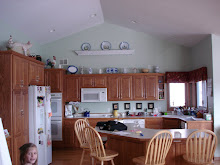
I've created a monster, or at least an addict. I didn't mean to. Had I been expecting company last Wednesday morning, I'd have brewed a fresh pot of coffee. However, not knowing my friend Cindy was about to arrive on my doorstep (she'd stayed the night before at her charming farm just outside of Belle Plaine, the Wedding Barn known as Rubies & Rust ~do click), I'd downed the last cup of reheated brew hours earlier, and was getting ready to make breakfast. I had to get ready to leave for a job site, but we visited while I puttered about the kitchen.  Cindy declined my offer of a smoothie of her own, but was finally convinced to try a taste of the bit that wouldn't fit in my glass.


That's all it took. "Oh wow! (uh-huh) That's good! (told ya) That's all you put in it? (yup) Is this a special blender? (nope) What else can you put in them? (anything)"  Hooked.


Nanapplenut Smoothie is my favorite breakfast, and the one that hooked Cindy:  One large apple (pink ladies are really good), one banana, a handful of walnuts, about a teaspoon of cinnamon, and a splash of buttermilk.  If you go light on the buttermilk, it comes out with an applesauce consistency, but a flavor worthy of company dessert, especially if you pop it in the freezer for a little while before serving.  This one is way more flavorful than you would think from the ingredients list.

Cindy was planning to come to a Saturday Studio gathering here, and immediately decided this would be her creative project, and potluck offering, in one. She would test smoothie recipes from the latest issue of Eating Well magazine. I'd seen them when the issue arrived, but hadn't had a chance to really look at them. They listed some strange ingredients, like a fermented tea, and used bottled juices, but sounded like a good place for her to start.

Pretty much anything in the fruit bowl(s) and vegetable crisper goes in a smoothie, and tea is a good liquid in place of juice or milk, if you prefer not to use those.

The ones she made on Saturday were very good, but I was a little bothered by the recipes. Part of the point of smoothies is to get lots of whole, fresh fruits and veggies, and though there are juice enthusiasts, the fiber in fruits and veggies is generally considered vital. Also, I'm fairly certain that bottled juices are heat processed to seal them, which would cook the micro nutrients. I know at least one of our mutual friends who will not even eat a cooked vegetable or fruit. I'm not nearly so rabid, but I've recently been looking into the science of food, and am convinced that (as mama advised all along) we would do well to get as raw and organic as possible, most of the time. I still love soups and stir fries, but at least part of the day's supply needs to be raw. Besides, bottled carrot juice is a heck of a lot pricier than a bag of carrots, and it creates a bigger carbon footprint in manufacture and transport, and a lot more waste.
Spa Lunch Smoothie:  This is a bright, tart, crisp smoothie, containing one chopped carrot, one orange, or a couple of mini tangerines, about a tablespoon of fresh chopped ginger, 1/2 to 1 peach (or the equivalent in frozen slices), and 1/2 cup tea.  If you want it a bit sweeter, add an apple.  If you want a little more substance, add a banana.  You can also add flax seed to this one.
My regular work schedule for the week completely rearranged by other contractors and designers, I found myself home today. Before settling down to work on book illustrations for an upcoming volume on the joys of correspondence, co-authored with Cat Isles of bridgingtheuniverse.com, I played around with the blender, and restyled a couple of the magazine's recipes.
Afternoon Pick-me-up-at-the-desk Smoothie:  1/2 cucumber, 2 kiwis, 1 very ripe pear, splash of buttermilk or dollop of yogurt.  Fresh mint would add a lot to this one, but in the dead of winter, it doesn't grow in my garden.  You can substitute an apple for the pear, of course, and strawberries would go well with the kiwis, or replace them nicely.

End-of-the-day Pint Smoothie:  blender filled with loose packed spinach, to which you add 1/2 cucumber, a couple of handfuls of blueberries, 1/2 large apple, a handful of walnuts, and 1/2 cup tea.  Spinach makes a very mild base for both sweet and savory smoothies.  Although the flavor of this one is mild, it has body, and is refreshing and satisfying at the same time...great taste that will fill you up, and won't make you too dopey and lazy to get back off of the couch and do something fun with the rest of your evening.
Smoothies are currently fashionable, but they aren't new.  I don't know if they were called smoothies in the 1970's, but my siblings and I made them for after school snacks, and called them "mucky slushes".  Ours usually featured some sort of nuts, and either fresh or home-canned fruit.  Our favorite was made by dumping a quart of mom's honey canned peaches into the blender with a generous handful of almonds, and sometimes yogurt.  If there was vanilla ice cream in the freezer, which was rare, we threw that in, instead.
 
Other times, we made similar concoctions for the salad course that always started dinner at our house, and called it fruit soup. If you're envisioning Martha Stewart formality, erase that picture, and substitute a tribe of denim clad, long-haired kids of both genders, bearded dad in logging boots, mama in her restaurant uniform, and a couple-three extra neighborhood kids, piled around a second (third? fourth?) hand table, in a half-remodeled farmhouse kitchen.  Sometimes instead of fruit blends, it was veggie.  Ever had gazpacho?  Taco smoothie.


Everything in moderation...
Now, one cannot exist on smoothies alone, of course.  At some point, chewing should come into the equation, both for the digestive benefits of saliva, the science of which you can track down, if you really want to read it, and the pleasure of experiencing the full beauty of well prepared food.  Personally, after all the vim and vigor of a smoothie powered day, I think a nice chewy brownie a most excellent way to end the evening.
...including moderation!


Author's note:  Please drink and drive responsibly.  If you make smoothies to go, please make them thin enough to slurp through a straw, as you cannot safely see the street ahead with your head tilted back, while you bang the cup against the bridge of your nose, trying to get the last delicious drop.  This will also prevent you from arriving at your destination with fruit puree between your eyes.

While enjoying your smoothies, you can be planning your next decorating project.  My portfolio of possibilities, and all the info on how to hire me, can be seen by clicking here:  theartofthehome.com.

If you have comments, do leave them below, or feel free to email me with creative questions at dawnmariedelara@gmail.com.  If I know any answers, I'm happy to share them.

Monday, February 13, 2012

Of icons and animals...it's all Divinely inspired!


Remember this photo from a couple of weeks ago?  I still haven't added gulls to the cliffs, but progress has been made on this mural...
A lot of the reason I write this blog is to attempt to demystify the creative process, and encourage you to stretch your own creative wings. I truly believe we are all born with creative potential, but some of us are steered firmly away from it, starting at a very young age, while others of us resist those well-intentioned efforts with every fiber of our being. The artist who inspired the style of this mural was a resistor from early on, and thanks to his tenaciously stubborn nature, we get to enjoy his incredibly beautiful and detailed carving and iconography (note to fledgling authors: it is a good idea to follow dubious compliments with lavish, though true, praise, if staying in the subject's good graces is at all important to you :)) ). Though the actual pieces are scattered around the globe, click on over to carvingart.com and check out the photos of the work of George Bilak.


More of George Bilak's work can be seen at Carvingart.com.
 Now, before we go any farther, let me warn you (and him), this mural looks NOTHING, well, very nearly nothing, like his work.

The ram may have been inspired by St. John, but is anyone else seeing John Travolta in the white suit on the Saturday Night Fever album cover?  No?  Oh, good.  Never mind.
See, what happened is that I was asked to paint a mural on a sixty foot wall, encompassing four doorways to the Sunday school classrooms, at Unity of the Valley Spiritual Center, but I immediately felt that the building is too modern, the kids way too cool, for my traditional, cozy, storybook style of art.  I knew, without hesitation, that I had to step outside of my comfort zone, and design something that felt energetic enough for both the location, and the congregation.  I was asked to create shaped door surrounds, and to include a rainbow, as the childrens' program there is called "Rainbow Circles".  Everything else was totally up to me.

The rainbow arches over the preschool and kindergarten ages doorway.  I think I'll add a litter of tumbling wolf pups, as this is the age where kids start to learn to socialize, and wolves represent that well.

A mama duck gives landing lessons to her ducklings, on the nursery door.  The tree will eventually house a nest of baby birds, and the meadow beyond...who knows what will come to life out there?

A jugle cat lounges coolly over the pre-teens doorway.  They'll have to wait for the sandy beach and jungle at their end to fill up with other exotic beasts.

This kind of freedom is exciting.  It's also terrifying to the point of petrification.  I knew I wanted a landscape with animals, and that it needed to have a dreamlike quality...if one happens to dream in technicolor.  As I was painting in the background, with absolutely no clear idea of what the animals would look like, I tried to suggest the various landscapes of the world, so that animals from every continent would fit somewhere.  This led to the red rocks in the center.  As I started to create them, I remembered George's icon, St. John the Forerunner, and asked the office manager to bring up his website, so I could see it. 

I think the bison shows the iconographer's influence in the stylizing and shading...if you kind of squinch up (yeah, I'm makin' up words again...my world, my words, my rules) your eyes and keep an open mind.
The shape of the rocks was what I was thinking of, but what also caught my eye was the tweaking of the proportions of background to figure, which I read is a feature of Byzantine icons (There are links from his site to pages that explain more about iconography, if this captures your interest.  It's definitely a disciplined art form.).  I was already planning to use a lot of white lines to pop highlights, rather than black to shadow things (Unity is all about light, so I wanted this wall to glow), and I realized the line work in this art form, though an ancient tradition, is actually very modern looking, and maybe something worth borrowing.

Having delivered his bundles, Stork wades in the pond near the nursery door.  I'm thinking he'll be joined by a frog, and some fish, then a meadow full of chipmunks, hedgehogs, and whoever else wanders into my dreams.
Now, as I said, I was inspired by this. In the creative process, it really isn't uncommon for the finished piece to look nothing like the art that inspired it. Inspiration is a jumping off point. To land anywhere near the budget, I needed to simplify. This mural was originally intended to be an eighty hour project. Even simplifying the animals to their exaggerated essential shapes and loosely brushing in the white line work, I'll end up with more than double that amount of time into it, so no way could I do a whole mural in tight icon style.

Check out George's iconostasis, to see what it looks like on that scale, and ask him how long it took to create the wall and the mural behind it. 160 hours would not even begin to touch it! And though stylized animals in George's art form would be really gorgeous, they would still be too formal for this church, and the style would take me half a lifetime to master (I would like to finish this before my ninetieth birthday, and preferably, before my next birthday). My thanks to Mr. Bilak for his gifts to the world, and for providing such an inspiring jumping-off place for this wild pink rabbit, and her technicolor dream scape. 

Rabbit leaps over Coyote the Jokester, in an attempt to catch up with Tortoise, who actually hasn't arrived in my little world yet. 
There are more animals finished, and many more to come, but I'll save them for another post.  As you can see, I work in a wide array of styles, and more of my work can be seen at theartofthehome.com, where you will also find all the information on how to hire me.  What's your dream world look like?

You are invited to leave comments below, or you can email me with creative questions at dawnmariedelara@gmail.com.

Thursday, February 9, 2012

Pretty Pantry Paint, Please!


What every well stocked pantry needs...it's own mural!
Remember last week's kitchen with dragonfly tiles?  Well, here's the rest of the project.  Not a lot of paintable walls in a pine paneled chalet-style lake house, so the owner had me paint the mural she wanted in the only spot available...the pantry.  She says the door is always open anyway, and as it's on the way from the front door to the kitchen, everyone passes by and looks in, so this way, there will be something nice to see.   The design of this mural is based on an early 1900's travel poster, with the name of their subdivision fancied up a bit, and the family canoe pulled up and ready to go.

The other part of the face lift was painting the kitchen island.  She had me paint over the mallard green with a white that compliments the tile, then give it a raw umber glaze to antique it.  We sampled a distressed finish, but she really didn't want to see a bit of the green, and without completely sanding off the existing paint, it's nearly impossible to sand off distressed spots, without showing the paint color underneath.  If she liked the original color, that would be absolutely perfect, but then, if she liked the color, we wouldn't be repainting, would we?
Before:  Island in original green painted finish.  Not hideous, but not her taste.

After:  Island in umber glazed Cameo White (Benjamin Moore Satin Impervo) finish.  

The island paint was chosen to coordinate with these tiles, which were featured last week.  If you missed them, scroll down for directions to create your own.
Although they have used this house as a weekend lake home, they find it suits their lifestyle better than their fancier house, so they are planning to move in full time, in the near future.  Tweaking a few details, like we did in the kitchen, was relatively quick and inexpensive, and a great way to save the budget for bigger projects, like bedrooms for the kids, and all that extra fun gear that living on the lake full time will require. 

To see more ideas for tweaking the details in your home, check out my website, theartofthehome.com.

You can leave comments at the bottom of this post, by clicking the word "comments", or you can contact me by email, with any questions at dawnmariedelara@gmail.com.