
 |
| They didn't have "macaroni and cheese" when I was a kid. Periwinkle still would have been my favorite, with thistle a close second. What was yours? |
1. Keep all the colors of the same intensity. Usually, you can figure this out by picking colors from the same position on the sample strips at the paint store. If in doubt, squint at the colors, and imagine them in a black and white photo. They would all be the same shade of gray.


 |
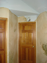
| In the upstairs hall, the green plays nicely with the colors in each room. Each color is of a similar intensity, so the eye travels easily across them. The white trim is a base note throughout the house. |
2. Cross-pollinate from one room to the next. Here in Belle Ami, the green of my foyer is picked up in the curtains of the front parlour...

The wall color of the parlour is an apricot not far off of the tones of the maple floor in the foyer, and moving the other direction, it is the base color for the ceiling in the adjoining dining room...

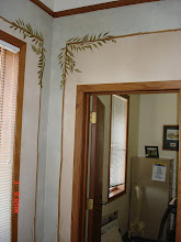
The greens and deep purples of the living room floorcloth repeat in the chair and drapery fabrics in the dining room...

Through the next double doorway, the greens, purples and apricots are picked up in the fabrics that adorn the window and ceiling of the drawing room (turned art studio). Use lots of different shades, so you don't have to worry about matching...
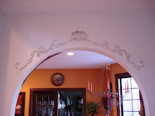
 |
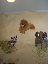
| Yes, this is the ceiling in my art and sewing room. |
You need not match all the colors, just carry the primary color of one room into the next as a secondary or an accent color.
3. Have a consistent base note running through the whole house, if possible. Here, I have maple floors in every room except the kitchen and baths. Shades of color that coordinate with the amber of my floors are likely to look good together. I also have wide white woodwork throughout. If you have a spouse who refuses to allow paint on that
None of these rules are set in stone. These are guidelines, meant to snap you out of color paralysis, and get you started living in full color, again. Remember when you were fearless about color? Remember when you boldly embellished your bedroom walls with the rainbow in your Crayola box? Yeeeesss? Okay, now get over the unpleasant bit that immediately followed that little adventure, even if your mama hasn't. You're a grown-up now, and not only are there 96 colors in the big box, these days (yes, I own that one), there are thousands more colors at the nearest paint store, and you can pick as many as you like!
 |
| No instructions required. |
Go splash some happy on your walls! If you can't find the perfect shade of paint, try creating your own, or you can always hire me to custom mix it, whether that's in a can for plain painting, or on your wall in a blended finish. My portfolio and all the info on how to hire me can be found at theartofthehome.com.
You can leave comments below, or feel free to email me at dawnmariedelara@gmail.com. I'm happy to answer your questions, if I know anything I think might be helpful, so don't hesitate to ask.


No comments:
Post a Comment