Ornamental Plaster Sculpting, Mural Painting, Faux Finishing, and Imaginative Interior Design.

Ornamental Plaster Sculpting, Mural Painting, Faux Finishing, and Imaginative Interior Design.
CLICK ON THE RABBIT ( yes, those are cabinets) TO SEE MY PORTFOLIO, AND LEARN MORE ABOUT MY SERVICES...theartofthehome.com

Monday, May 28, 2012

No bunny was harmed in the making of this post...(Inspiration MacKenzie-Childs)


I spent much of Friday moving plants from a friend's garden to my own, and even went back Saturday, despite rain and mud and mosquitoes, to bring home a few more things. This may not seem like much to most gardeners, but first, may I remind you that I'm the class clown in garden club, known for my fabulous patch of dandelions and creeping Charlie. Second, may I point out that the flower beds I'm planting did not yet exist, and required a good deal of sod-busting, as my dream is to replace the front (ahem) lawn with a cottage garden.


Friday went well, and despite being bone tired, I was pleased with the amount accomplished. Saturday morning it poured, but a quick check of the hourly forecast assured me it would let up by mid-afternoon. By 9:30 that night, all possible plants were moved.  I was soaked to the skin, covered in mud, and my finger tips were too raw to scratch the gazillion mosquito bites I had incurred, but I was again pleased with the amount accomplished.

Niemanmarcus.com (you can click it, it's a link) carries these hand-crafted garden finials from the MacKenzie-Childs studio, if you wish to purchase, rather than make.  My eye is drawn to both the colors, and the "collars" at the base of the finials.
 Sunday was forecasted to be hot and humid, so I planned an afternoon in the studio, making finials to top the hose guide stakes. I had been prowling pinterest a few days earlier and spotted some sweet ceramic ones by MacKenzie-Childs. Though to the best of my knowledge, Richard and Victoria MacKenzie-Childs no longer own the brand, nor produce the wares, Nieman Marcus still charges $130-$190 apiece for these!  I don't think the original artists are profiting from the fame of their name, but the finials are at least hand made in the USA.  Anyway, I love the patterns and riotous colors of their signature wares, but even if I was willing to spend that much on one little garden ornament, I'd rather make my own, and in this case I decided I would rather create the patterns with mosaic than paint..


Glass spheres, such as light globes, vases and votive holders for the globe part, bud vases for the part that connects to the stake, ruffly-edge glass dishes for the collars, lots of glass pebbles, some mastic and nippers...
  I headed to the basement, where I happen to have a wall of glass-filled shelves, and a table of china and tile, and rounded up what I needed.  Yeah, I actually have this stuff on hand.  I'm not a hoarder!  I used to have a boutique, and I made stuff like this to sell.  Now, I just keep a well-stocked stash so I can get all my friends hooked on my little addictions.

...and a box full of china and tile bits.  Tea cups are extra good for doing mosaic on round surfaces.
After a good bit of nipping, sticking, grouting and gluing, here's what I came up with...

Heh-heh-heh!  Bunny in a blender!  Actually, this is the step where you turn them upside down to glue the vases on the bottoms, and the blender was the only thing handy that would hold this one.  Really, as I said, no bunny was harmed.
 Okay, maybe upright in the garden would be better...


They were nice just round, like the inspiration pieces, but I do like finials with extra height, so I raided the basket of  figurines and salt shakers. 

Since I had left-over brown grout from last week's mosaic fireplace, I decided to try it here.

A little bluebird for happiness.

They aren't really very similar to the inspiration pieces, but that's the way of art.  Another artist's idea sparks one of your own, and off you go, following your own inclinations.

They were a lot of work, mostly because I'm pretty fussy about assembling my mosaics, but at the end of the day, I was again pleased with what was accomplished.  This is a good thing, because as I sat working on these Sunday, the heat was being driven by fierce winds that wreaked havoc on the poor new transplants, and then late in the afternoon, came the rumble of thunder, followed by hail.  I'm hoping the garden looks better in a few days than it does right now, because if not, I may still be the goofball of garden club, now with a fabulously decorated patch of dandelions and creeping Charlie.  Sigh.

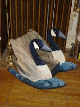
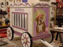
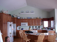
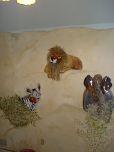
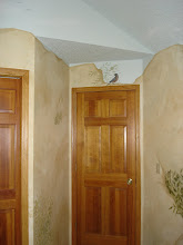
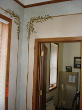
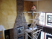
When not attempting to be a gardener, I paint some pretty cool walls and things (like the rabbit-in-a-garden kitchen cabinets at the top of this page).  You can click on over to my website, theartofthehome.com, to see my portfolio, and find all the information on how to hire me.

Feel free to ask questions or leave comments below, or by emailing me at dawnmariedelara@gmail.com.


Thursday, May 24, 2012

Not so typical traditional...

Earlier this spring, I did some painted ceilings for a client, and promised more photos when the whole house was finished.  Today, I did my final touches, delivered my new favorite piece of cobbled furniture, and collected my final hug of the project.  I also snapped a few photos... 
This bench (settee?) was inspired by one that came across my facebook page several months ago.  It's made of two dining chairs, 2/3 sheet of 3/4 inch plywood, three fabrics, two trims, a billion staples, and limitless patience.  Well, maybe more like four hundred and thirty-seven staples, and nearly limitless patience.  Nothing went wrong on this project, but when working with salvage, nothing is ever perfectly symmetrical, square, or even.  If I had a place to put one, I'd still build another in a heartbeat!

The homeowner, Jodi, helped me do this mosaic fireplace about a year and a half ago.  It was the only thing in the house that survived a fire last autumn.  I had to replace the mirror that surrounds the insert (which they changed), and re-grout it. Lucky for me, when I got to the final polishing phase, Jodi jumped in to help again.  Mama said whining would get me nowhere, but I find it's still pretty effective for getting someone else to clean up my messes.  Thanks, Jodi!
Here's a shot from before, which shows the sparkle a little more.


"B R e A T H e"


Here's that ceiling medallion from a few months back, with the light, wallpaper and furniture in place.  I can't imagine this room without it.

Scumble glazed walls, a sky ceiling, and a trompe l'oeil plaster border over the archway were my contributions to this charming butler's pantry.

Full view of the butler's pantry paint.

...and a close-up.

This room, I had nothing to do with decorating, but it is so striking, I thought you might like to see it.  On projects throughout the house, Jodi had assistance from Patti Schulte of Casabella Interior Design of Huntersville, North Carolina, and local designer, Chris Rowe Wallraf ( chriswallraf.com ).  A lot of Jodi's lighting and accessories came from Rosie Posie, a shop in Prior Lake, MN ( rosieposie.net ).
Ahhh, completion.  As much fun as these projects are to do, it's satisfying to see them finished.  Jodi is already compiling a list of details for me to do once they get all settled back in, so I'm sure you'll be seeing many more photos of her beautiful home on here.  Now, you may be reading this with your morning coffee, but I'm typing it at 11:20 p.m., which is about three hours past my bedtime, and that last photo has me craving my own fluffy pillow, so I'll wish you a good night, and a great Memorial Day weekend!

More photos of my work can be seen at theartofthehome.com, and comments can be left below, or emailed to dawnmariedelara@gmail.com.

Monday, May 21, 2012

You might be a magazine junkie if...

If you check the reference book shelf in my art room (don't know why I can't call it a studio, but I can't), you might notice that about half of the books are actually magazines.  I'm very fond of magazines.  I always have been.  I remember trying to make one of my own when I was about three, showing my dad my pages of squiggles interspersed with words, and carefully drawn pictures.  I think I set the idea aside when he suggested that perhaps I needed to increase my written vocabulary a bit before it went to press.

Perusing my art room bookshelf, you will notice about six different publications dominate, and most issues have multiple bookmarks sticking out.  Magazines are still my favorite reference material for inspiration when I'm designing new projects. 

Of course, as much as I love magazines, I don't keep them all.  This basket, tucked under one of the work tables in the room-formerly-known-as-the-dining-room, holds a stash meant for art journaling and collage projects.  When it overflows, friends are pressured to take armloads, as it is only as a last resort that I relegate magazines to the recycling bin, cut and slashed though they may be.

Some magazines, like Old -House Interiors and Family Handyman, I adore, but with a stash of three or four years each, I have all the (great even for beginners) carpentry and American architecture reference I'll ever use, so I don't subscribe anymore.  Threads is geared to people who have far more patience with the minute details of couture sewing than I will ever have or need, so I just keep a few old issues with projects I can fake, should I one day decide to upgrade my wardrobe to something flashier than paint rags.  The charming Home Companion, of which I have nearly every issue, is sadly no longer published.

My reference shelves hold a couple of years of old issues of these publications.  I especially find myself drawn to those 100 Ideas sorts of magazines, though in recent years I have noticed that quite often, a photo will have been recycled more than a few times.  I know this.  I have the first two editions wherein the photo was featured, and tear sheets pulled from other editions in my morgue files.  I expect compilation editions to be made up of re-runs, but really, there are episodes of Friends that have been recycled fewer times than some of these articles.

These are the ones that come in my mail box, these days.  House Beautiful consistently relates to the homes of most of my clients, Better Homes and Gardens gives me a steady overview of what's currently popular, since I had to break my addiction to decorating shows a few years ago, by cancelling cable service.  Eating Well and Nutrition Action are my foodie/health nut parents' annual Christmas gift.  I especially like Nutrition Action, which investigates the science behind the "science" that advertisers tout, and explains it in normal people words.  If you want to understand food (and the staggering amount of unfood out there), click here:  cspinet.org.
These gorgeous publications are just a few of those put out by Somerset Studio.  They are pricey, at around $15 an issue on the newsstand, but they are full of great content, full-color photos on every page, and very little advertising.  They deserve to be on any book shelf.

I love magazines so much that a few years back, when I had a little "occasional shop" called Nest Feathers, which was open one long weekend a month, the idea was to create "a magazine come to life", so the posters that advertised it were designed to look like a magazine cover.  The print version had some hand lettered detail, but this is the version that ran on the blog.  Alas, as much as I love beautiful little shops, actually tending one, like actually being a caterer, was a fun experiment, but not my dream career.

Here's what I do with some of the clippings that I pull from magazines.  This is an idea book/visual journal.  I've been doing them since I was still of napping age, which might explain both my magazine addiction, and the aforementioned magazine venture.  This page was done about a month ago, when after three straight weeks of twelve hour work days, I finally took a day off, and spent it in my pajamas, cutting, pasting, and ignoring the world outside.  Why do I do this?  To clarify preferences, save favorite snippets for future reference, and to gather inspiration and ideas...
Okay, so you know I'm addicted to magazines.  You know I love to write.  You know I have a book about Belle Ami (this quirky old house) in progress, and if you really read this blog, you know that I am co-authoring and illustrating a series of lifestyle books with my friend Cat Isles.  Well, one of our problems with the book series is that there are so many topics we will eventually cover.  That's it.  Eventually is the problem.

We can't write, illustrate and promote them all at once, and we don't want to wait several years on any of the topics.  The process of compiling the journal page shown above triggered an "Aha!" moment.  Outlined in brown at the bottom of that journal page are three niche market magazines, published quarterly, available mainly by subscription, and successful enough to be featured in an article by a major national magazine.  Last week at our author's meeting, I showed these to Cat. 

This week at our author's meeting, Cat presented me with magazine production costs, corporation and tax info, website particulars, and her list of departments and names.  I presented her with a mast head design, style samples, my list of departments and names, marketing strategies, and a couple of possible articles.

The first issue of 365 Being will be rolling off the presses in late August...!!!!!! 

Is it a little early to share this?  Maybe, but Cat gave her consent, and since this is all I can think about now, what else was I going to blog about?  Besides, early subscribers will get great deals, so remember I post Monday and Thursday nights, and you'll be the first to get the scoop, as details unfold.

If you wondered about the unusual background to most of the photos, that would be the upholstery, piled on the work table, waiting to be attached to a settee I built and painted, and which I promised to deliver tomorrow morning.  It's now ten p.m., here in the Midwest, so good thing I'm not only a magazine junkie, but a deadline junkie as well!  I'll post photos of that sweet little piece on Thursday.

You are invited to leave comments below, or email me at dawnmariedelara@gmail.com.

Thursday, May 17, 2012

Why leave it white?

Sometimes, people think that because most galleries display art against white walls, white is best behind the art at home, too.  I find this to rarely be the case.  Galleries have to showcase such a variety of art, it's usually easiest to just leave the walls white.  White rarely detracts from a piece, but I truly believe most art is enhanced by well-chosen color, on the wall behind it.  Think of it as another mat.  
After:  This grenadine-coral color, in a brushy blend, perfectly enhances the playful tone of this children's gallery, which greets guests immediately upon arrival.  The art makes a statement about this family and what they value.  The wall color is the exclamation point.

This collection of children's art, along with the artists' photos, is complimented beautifully by a whimsical coral red wall treatment. It's a really bold color, perfect for this family, but certainly bold is not the only choice, if it doesn't suit you. If you favor paintings of old world scenery or buildings, you might find a golden ochre shade on your walls will show them off, or a terra cotta (the color of clay flower pots). If you want to play up black and white photography, one of my favorite wall colors for this is a periwinkle (medium slightly purplish blue), or a blue the color of a chambray or oxford cloth shirt. Sometimes, you can pick an accent color out of the artwork, and other times, it works best to choose something totally opposite of what's on the canvas. Your best bet is to take time to play around with different possibilities.
Before:  The foyer had great artwork, but plain vanilla walls, which didn't suit the homeowners, and didn't do anything special for the art.

My favorite way to test colors these days is with tagboard samples. You can now buy 1/2 pint samples of custom mixed paints, in most major brands, for about five bucks. The same paint store can sell you mini rollers, and if they don't carry poster board, most drug stores, and all art supply stores carry it, as kids need it for school projects all the time. You will end up with big 24 x 30 inch samples, which you can slip behind your art work.

I'm not a fan of sampling directly on the wall, as the edges can leave a slight raised outline that shows through the final coat of paint, if you don't know how to feather them out properly. Besides, with a board, you can move it around the room, testing the color in different light, on different planes, at different times of day. A color you love in the middle of the day may be glaringly brilliant at seven in the morning, or unexpectedly gloomy at seven in the evening, though the "wake up!" and "snooze" effects might be perfectly to your liking.

As with art, when it comes to color preference, beauty is in the eye of the beholder, and the only beholder who matters is you. Pick art you love, play up the colors in it on your walls, and you will be surrounded with whatever emotion drew you to the piece in the first place. Bliss.

You can peruse my portfolio of possibilities at theartofthehome.com, and if you have questions or comments, please feel welcome to leave them below, or email me at dawnmariedelara@gmail.com.


Monday, May 14, 2012

This could be my garden...sort of...someday...

Disclaimer:  All of tonight's photos are of the garden of TC and Carol Fogarty, and I assume absolutely zero credit for the gorgeousness depicted, beyond my amazing ability to use the "sharpen or blur" function on my computer to bring the photos into focus.
The entrance to the woodland garden of my friends TC and Carol.
Sooo, it's gardening season once again, and Valley Garden Club had their annual plant exchange last week, up at TC and Carol Fogarty's place. Some folks grow tomatoes and peppers, some folks love their perennials, and others collect hostas. I'm the pathetic one who grows dandelions and ditch lilies. At least, that's been my reputation in previous years. This year, I finally had enough of my prized dark pink lily to share a few, and even some Stella d'Oro lilies to divide. Though probably the baby of the bunch, I feel I'm finally one of the grown-ups.


TC's new tiki torches light the way on dark evenings.  That will be the garden club's 2013 spring project.  Check back this time next year for instructions.
Actually, I do think becoming a real gardener might be a sign of a certain maturity. In previous years, I have sometimes started to tend the beds, even planted a few seedlings, but by mid-June, if not (sadly) sooner, I am sidetracked by "work that must be done", or projects that offer far more immediate gratification, and the perrenials and the pigweed are left to fight it out.

Let's face it, gardening, of the ornamental variety, rarely offers spectacular results the first few years. It takes a couple of years to find out the outcome of your efforts. Like the fact that the shrubs you laboriously transplanted hate their new surroundings, and despite your best efforts, they ever-so-slowly die, keeping you hoping to the very end, that they just might green back up. Or that the plant you thought would make great ground cover has covered all your ground and half of your neighbors', and they are threatening to have you charged with horticultural trespass. Personally, I have a hard time waiting ten minutes for cookies to emerge from the oven, so as much as I covet a charming cottage garden, I've not had the patience to get much beyond a straggly bed of zinnias, and the lilacs, ditch lilies and hydrangeas that were here when I moved in, seven years ago.


This pergola over the entrance to their fire pit was built several years ago, partially with salvaged wood.  Though TC upgraded most of the paths from mulch to cedar planks this year, the gravel that surrounds the firepit looks best extended below this structure.
This year however, I'm feeling like I might be able to honor the season, and aside from balcony trim that's peeling badly, and some lawn furniture needing a spruce-up, I may be able to leave the paint brush aside on my days off, and relax into the rhythm of summer. After some rough times and close calls, Belle looks like she'll be my home for life (confirmed by the spectacularly inverted dollar value, in the bank's eyes), so maybe it's this assurance that had me out over the weekend, wrestling lilacs that were threatening to overtake the alley, and moving them around to the front yard. Just a note:  Even a fairly short, well-established tree has a root ball heavier than the average person can lift into the wheelbarrow, and will block all commercial traffic in the alley. Beer truck drivers are not always willing garden assistants, though the slight wardrobe malfunction with the tank top snagged in the branches may have lightened the mood a tad.
These sweet windows were originally their attic windows.  They upgraded to efficient reproductions in the house, but made use of the old ones, here.  If this was a vine-covered structure, I can imagine the windows actually being functional.
This year, if the humidity doesn't turn me into a sodden mass of whininess, and the mosquitoes don't drive me into a crazed frenzy of slapping and swear words, I might be mature enough to really start the garden of my dreams. This year, I may be able to get my priorities straight, and live with the season, rather than putting the garden off for "someday when I have time; when I have money for fancy plants; when I have the income to pay a gardener to weed the thing. Oh, yeah. I forgot about the weeding. Hmm. Well, I did say maybe this is the year, didn't I?. 
This little tea house sits to one edge of the woods.  TC's granddaughter has recently informed him that the roof needs some work to be of any use at all.  Duly noted.

When not torturing neighbors with my impressive dandelion growing abilities, I try to delight clients with my painting skills.  You can see my portfolio at theartofthehome.com.

If you have questions or comments, feel free to leave them below, or email me at dawnmariedelara@gmail.com.  If you have an uncontrollable urge to pull weeds, you know where to find Belle Ami.

Thursday, May 10, 2012

A fine dining experience...

Chinoiserie (that's fancy for "in the Chinese style", and usually refers to walls decorated with branchy formal trees with birds) dining room.
When I met Anita a couple of months ago, the house she and her family had moved into in October was all white, except a couple of pink walls.  Now, I'm a fan of pink, and I even have a dark pink kitchen that leans toward an old sugary-rosy mauve, but this dining room was a sad, dreary mauve.  It was the kind of color that makes you think of the old auntie who insists on perfect table manners, while boring you to near-death, with stories of the funerals she attended last week.  Ugh!  Anita wears beautiful clear colors, and she is one of those women who actually seems to glow when she smiles, so this house didn't seem to suit her at all...yet.

Dining room before
Though keeping things a little lighter in most of the house, Anita wanted a deeper color in the dining room, and had pictures of several jewel toned dining rooms, pulled from magazines.  By the time we sorted it all out, the red ended up being an accent color in the foyer, and the mossy green an accent in the family room, so this left a rich peacock blue.  Looking through my clipping files, she pulled out several versions of chinoiserie, something she hadn't even thought of doing.  Tempting a gardener with leafy designs in March, in Minnesota, is perhaps some sort of decorator fraud, but I swear it wasn't premeditated!  Anyway, she asked me to paint her chinoiserie as a tree of life, beginning under the window, and branching to each side. Three chickadees live amongst it's leaves, and two have escaped to fly around the room.  Much livelier, don't you think?


This little chickadee headed for the kitchen...

This little chickadee stayed home...

...and this little chickadee winged it to the opposite side of the room!
The peacock color, which was custom mixed, carries into the foyer in a lighter version, Benjamin Moore's Jamaican Aqua, then reappears in the master bedroom accent wall (featured in the last post), and again in a light version in the master bath.  This color fits perfectly with the current trend toward clear (as opposed to muted or shaded) colors, but it's a classic in traditional design, so even when it's not trendy, it will still look just right with the mahogany dining room furniture.  Timeless.

Now, here are a couple of shots of the bathroom.  If you like, you can scroll down to the last post to see the master bedroom it coordinates with.
Master bath with 5-color Woolie blend, including beach glass shades of blue and green.  Imagine it a few shades softer, please.

From "his" mirror, you get a view of the master bedroom accent wall, featured in the last post.  I think I'm better with the paint brush than the camera.  The bathroom is actually a soft aqua and periwinkle blend, with lots of fresh white, but the camera only sees bright turquoise, and I'm no expert at tweaking it back on the computer.  Still, you get an idea of the pattern, and how it all relates to the bedroom.
The chickadees have appeared in a few other murals, which can be seen on my website, theartofthehome.com, along with the information on how to hire me to liven up the rooms in your home.

Questions or comments are always welcome!  Leave them below, or email me at Dawnmariedelara@gmail.com.

Monday, May 7, 2012

An abstract impression of an impressionist...

Painting faux finishes is artistic, but for me, it's interesting for the first half a wall, and then it's just repetitious.  At this point, my inner three-year-old (who pretty much runs the show around here) flings her imaginary self to the floor, kicking her heels, and whining "I'm bo-ored".  Hey, just 'cause I don't have kids, don't think I don't know what you all go through.  Just because the whiner clinging to my knees is my alter ego, doesn't make it any easier to work while dragging her along.  You at least get to leave yours at daycare.  "Missy Sunshine" is as firmly attached to me as my shadow. 

I know, I know, I could have raised her to be less of a brat, or banished her, like a sensible (sane?!?!) grown-up, years ago.  But then, who would inspire me to fingerpaint swirls on the living room walls, or to buy the lace trimmed jeans for paint pants?  Heck, who would cut my hair on those crazy hot August days?  I've made peace with her, and most work days, I bribe her with promises of  pajama days to come, if she'll just stop reminding me how many more walls there are ahead of me, and let me paint in peace.  Last week, she didn't have to be convinced too often.  Last week was fun.  Take Wednesday's job, for instance:
Impressionistic mural on master bedroom wall.
My client, Anita, wanted something different for the accent wall in their master bedroom, and liked both the trowelled paint finish in my bathroom here at Belle Ami, and a similar sample of a job I did last year.  As we talked about it, I realized this was an opportunity to use the technique, but to create something more interesting than just an all-over pattern.  I knew she liked Renoir, and she wanted a watery feel, so I googled impressionists for some inspiration. 

Monet painted countless versions of the pond with lilies, and we chose this one for the overall balance of the composition.
It might be the shape of their bed, reminding me of his bridge in Giverny, but I was thinking of Monet's water lily paintings from the start, and sure enough, that was what she chose. Now, my wall  isn't intended to be a copy of the painting, just inspired by it, and using the movement in the piece to guide my placement of color on the walls, was pretty good insurance that Anita would like the end result. I've seen Mansions with Monet replicas painted full-surround in some rooms, but that would just be tedious copying, and Missy Sunshine would whine for sure. I think this was a waaay more fun way to spend the day, and my clients thoughts? "WOW! ...Wow... Wow!" (Bob) and "I love it!"(Anita), were the perfect end to a long but happy day. Oh, plus a great big hug from their (very real) youngest daughter.

Close-up.  I don't think Monet used a drywall trowel and a sea sponge, but then, he painted on slightly smaller canvas.

Wanna see what else my inner child has helped me paint?  Click on over to theartofthehome.com to see my portfolio, and for all the information on how to hire me...us. ;)

You can leave messages for either myself or my other self, in the comments below, or by email at dawnmariedelara@gmail.com.  Sorry, Missy Sunshine does not get her own email.  That would just be crazy.

Thursday, May 3, 2012

Rockin' the jungle for prom...

 Sometimes my job is just fun. Fun like back in high school, making decorations for the prom. Except between high school and now, I did a stint in the event industry, so I know a few pro tricks for props and backdrops. Basically, it's all about the duct tape...and the drywall screws...and the sonotubes. Everything can be built from sonotubes and duct tape. If it can't you probably don't need it.

My friend Toni Fogarty (click here frontporchphotos.com) shoots the photos for prom, and wanted something that would go with the theme, but coordinate with every dress. Most years, this ends up being some variation on black. This year, with the theme being "Jungle", nature's neutral filled the bill. And some of those leaves are even real...


Best dressed couple in the jungle.  I don't actually know many of the local high school kids, so I picked the pair that looked the most striking with the backdrop.  She knows what suits her, huh?  And what guy wouldn't look fine in a black suit and purple tie?


sonotube, floral shipping box, front porch photography's break room stool (sorry, Cindy, it's not coming back), empty mud bucket, two overturned flower pots, one plywood scrap, dozens of drywall screws, thirty feet of duct tape.   Looks like a jungle to me.

The covering is made of old bed sheets torn into strips, dipped in "monster mud" (1 quart premixed joint compound + 1 gallon of paint), and draped.  I did add some wadded up newspaper to the basic structure, attached with another sixty or so feet of duct tape, to create soft rounded edges.  I also inserted some screws to hold the heavy bits in place until dry.  When dry, this is like a slightly flexible paper mache, but way more durable.  I don't recommend wearing the stuff.

Not sure if they looked more like rocks or stumps, but with a background and floorcloth  (painted using every old leaf stencil I've ever cut), and filled with six houseplants, they looked pretty good.  In fact, I think the phrase was "freakin' awesome".  If I'd had kids, they would be about prom age now, so "freakin' awesome" made me feel not quite so old.  The fact that I spent a few mornings last week on my front porch, making prom decor, and being able to call it my job, was pretty freakin' awesome.

Okay, one more.  Aren't they cute?
Making props?  If you have questions, I'll be glad to share any answers I know.  Leave them in the comments below, or feel free to email me at dawnmariedelara@gmail.com.

Wanna see what else I do?  Click over to theartofthehome.com, to check out my portfolio and the information about the services I provide, though I don't think it listed prom decorator anywhere, there.