
Sometimes, people think that because most galleries display art against white walls, white is best behind the art at home, too. I find this to rarely be the case. Galleries have to showcase such a variety of art, it's usually easiest to just leave the walls white. White rarely detracts from a piece, but I truly believe most art is enhanced by well-chosen color, on the wall behind it. Think of it as another mat.
 |
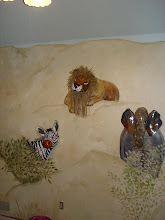
| After: This grenadine-coral color, in a brushy blend, perfectly enhances the playful tone of this children's gallery, which greets guests immediately upon arrival. The art makes a statement about this family and what they value. The wall color is the exclamation point. |
This collection of children's art, along with the artists' photos, is complimented beautifully by a whimsical coral red wall treatment. It's a really bold color, perfect for this family, but certainly bold is not the only choice, if it doesn't suit you. If you favor paintings of old world scenery or buildings, you might find a golden ochre shade on your walls will show them off, or a terra cotta (the color of clay flower pots). If you want to play up black and white photography, one of my favorite wall colors for this is a periwinkle (medium slightly purplish blue), or a blue the color of a chambray or oxford cloth shirt. Sometimes, you can pick an accent color out of the artwork, and other times, it works best to choose something totally opposite of what's on the canvas. Your best bet is to take time to play around with different possibilities.
 |
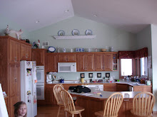
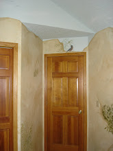
| Before: The foyer had great artwork, but plain vanilla walls, which didn't suit the homeowners, and didn't do anything special for the art. |
My favorite way to test colors these days is with tagboard samples. You can now buy 1/2 pint samples of custom mixed paints, in most major brands, for about five bucks. The same paint store can sell you mini rollers, and if they don't carry poster board, most drug stores, and all art supply stores carry it, as kids need it for school projects all the time. You will end up with big 24 x 30 inch samples, which you can slip behind your art work.
I'm not a fan of sampling directly on the wall, as the edges can leave a slight raised outline that shows through the final coat of paint, if you don't know how to feather them out properly. Besides, with a board, you can move it around the room, testing the color in different light, on different planes, at different times of day. A color you love in the middle of the day may be glaringly brilliant at seven in the morning, or unexpectedly gloomy at seven in the evening, though the "wake up!" and "snooze" effects might be perfectly to your liking.
As with art, when it comes to color preference, beauty is in the eye of the beholder, and the only beholder who matters is you. Pick art you love, play up the colors in it on your walls, and you will be surrounded with whatever emotion drew you to the piece in the first place. Bliss.
You can peruse my portfolio of possibilities at theartofthehome.com, and if you have questions or comments, please feel welcome to leave them below, or email me at dawnmariedelara@gmail.com.


No comments:
Post a Comment