
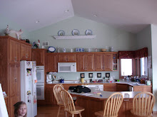
St. Cloud homeowners, Joan and Donna, hadn't really planned on doing anything major to their guest room, just a little touch-up to the paint, once the leaking windows were replaced. Except the touch-up paint left by the former owner wasn't the right touch-up paint, and Donna didn't discover it until she had happily dotted it all over the walls, where it dried about two shades darker. Ummmm.....Oops? Luckily, they know who to call for paint emergencies. Lucky for me, that is!
 |
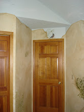
| BEFORE |
Donna was willing to go much richer in color, and wasn't married to the border, but Joan really wanted to keep the border, and the light, airy feeling of the room, though maybe a little cozier would be nice. We held up sample paint colors, and decided that the existing yellow didn't match the tan of the border, but the tans that did just seemed lifeless. Pale greens went nice with the border, but didn't seem to do anything for the woodwork. At this point, we dug into my sample portfolio, and pulled out everything that appealed.
 |
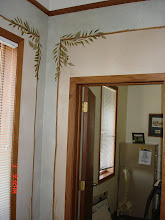
| AFTER |
What we came up with was a velvety blended finish that used a combination of colors: two greens, a tan and a light reddish-brown. The overall effect is green, but the light golden tan keeps it airy and ties to the tan in the border, while the bits of reddish brown add depth, and a link to the woodwork. You may not get the full effect from my less-than-spectacular photos, but the result was that we couldn't imagine anything possibly being more perfect. The colors match the colors in the border perfectly, the woodwork is dramatically highlighted, and the room feels cozier, but still fresh as spring.
I could have used the same colors and technique, but barely blended it, and achieved a really dramatic finish that would have knocked your socks off when you walked in, but what we wanted here was an airy, cozy, peaceful retreat to embrace the guests who frequent this home, so subtle was the right way to go. The proof that it works? I slept like a baby in that room last night. Of course, that could be as much because I was too tired to drive the two hours back to Belle Plaine, as because of the peaceful paint.
 |
| This finish was created with a Woolie tool with a really tight texture, and a lot of patting to blend the four colors to a subtle velvet finish. The colors are Benjamin Moore Lewiville Green (a muted spring green), Kennebunkport Green (a muted light blue-green), and Jackson Tan ( a light reddish brown). The fourth color, a golden tan, is Hirshfields Doubloon. Click to enlarge, click again for close-up, and please ignore the dark spot in the center...I seem to have scuffed the camera lens. |
Tackling it yourself? Yeah, you! If you run into trouble, feel free to ask me questions. If I know the answer, I'll be happy to share the information. Just ask. dawnmariedelara@gmail.com


No comments:
Post a Comment